Everything’s bigger in Texas, expectations included. In 2026, your website isn’t just a digital presence; it’s your first impression, your best salesperson, and sometimes your only chance to win a customer. The catch? Most Texans are meeting your brand for the first time on a smartphone, not a desktop. If your site loads slowly, breaks on mobile, or forces users to pinch and zoom like it’s 2010, they’re gone; no second chances, no apologies.
With Google’s mobile-first indexing firmly in place and users demanding fast, intuitive experiences, mobile-responsive website design is no longer optional. It’s the foundation of visibility, credibility, and growth in today’s competitive digital landscape, especially for Texas businesses.
Mobile-First Indexing: Google Has Already Made the Decision for You
Google doesn’t “prefer” mobile-friendly websites anymore; it expects them. With Google’s mobile-first indexing, the mobile version of your site is now the primary version evaluated by search engines for rankings, indexing, and visibility.
That means if your desktop site looks great but your mobile experience is clunky, your search rankings still suffer. Poor mobile responsiveness leads to weaker user signals, higher bounce rates, and lost Link Equity, all red flags to search engines. In short, your website design and SEO optimization are now inseparable.
In 2026, ranking well without a responsive web design is like trying to win a rodeo on a unicycle. Technically possible, but painfully unrealistic.
Texans Are Mobile-First—and Extremely Impatient
Texas users are mobile-heavy across industries, from local service providers to enterprise B2B brands. Whether someone is searching for a contractor in San Antonio, comparing vendors in Dallas-Fort Worth, or shopping online in Houston, mobile is the starting point.
And here’s the brutal truth: Texans don’t wait.
If your Page Load Speed exceeds three seconds, bounce rates skyrocket. Core Web Vitals, especially Largest Contentful Paint and Interaction to Next Paint, play a massive role in how Google evaluates mobile usability. Slow load times don’t just annoy users; they directly impact conversion rates and search visibility.
Better User Experience = Higher Conversion Rates (It’s That Simple)
No one wakes up excited to fight a website. A clean, intuitive User Experience is what keeps visitors engaged and converts them into customers.
Responsive websites naturally improve UX by:
- Adapting navigation links for thumb-friendly interaction
- Using white space strategically for readability
- Implementing scalable typography that works across devices
- Making calls to action easy to tap, not hunt for
When users can scroll, click, and convert without friction, bounce rates drop and conversion rates rise. This isn’t design theory; it’s measurable performance. Google Analytics consistently shows that mobile-friendly design leads to longer sessions, stronger engagement, and better outcomes.
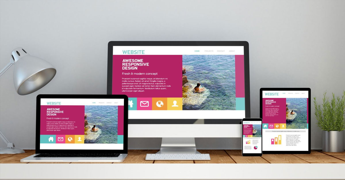
What Actually Makes a Website Responsive in 2026?
Let’s break the tech down without sending anyone to sleep.
Modern Responsive Web Design relies on flexibility, not fixed layouts that crumble on smaller screens. Fluid Grids allow elements to resize proportionally, while CSS media queries and Container Queries adapt layouts based on screen size and component context.
Media Queries control how designs respond to different devices, while Container Queries, now widely supported, allow individual sections to adapt independently. Add responsive frameworks and a Mobile-First Approach, and you get websites that feel intentional instead of “shrunk down.”
Responsive Design and SEO: A Power Duo You Can’t Ignore
Mobile responsiveness directly supports search engine optimization in ways many businesses overlook. Responsive websites:
- Reduce bounce rates across devices
- Improve crawl efficiency for search engines
- Strengthen local SEO signals
- Enhance SERP rankings through better user signals
Features like lazy loading improve Page Load Speed, alt text strengthens accessibility and image SEO, and content delivery networks ensure fast performance statewide. Google rewards sites that prioritize usability and punishes those that don’t.
Texas Competition Is Brutal—Your Website Must Do More Than Exist
Texas markets are crowded. Simply having a website isn’t enough anymore.
Template-based designs often fail because they ignore site branding, user behavior, and performance optimization. Custom website designs, on the other hand, align responsive mobile design with business goals, audience intent, and digital longevity.
Texas businesses benefit from:
- Custom platforms built for scalability
- Texas-themed visuals that reinforce local identity
- Responsive agencies that understand regional competition
- Designs that meet modern web standards
Standing out online requires more than “looking professional.” It requires strategic execution.
E-Commerce, Security, and Smart Devices Leave No Room for Errors
If you sell online, mobile responsiveness is directly tied to revenue. Mobile-responsive e-commerce functionality improves checkout flow, reduces cart abandonment, and builds trust.
Security matters just as much. An SSL certificate isn’t optional; it’s a ranking factor and a trust signal. Add proper SSL certification, secure CMS platforms, and compatibility across smart devices like Google Pixel phones, and you create a seamless, credible experience.
Government-Level Design Standards Are Shaping Private Websites Too
Design systems like the United States Web Design System (USWDS) have raised expectations across industries. Federal-grade UX principles, such as proper color contrast, logo lockups, and accessibility-friendly color systems, are now influencing private-sector websites.
Tools like color contrast checkers and structured design tokens aren’t just about compliance; they improve usability, readability, and SEO. In 2026, accessibility and responsiveness go hand in hand.
When Is It Time for a Responsive Website Redesign?
If your site shows any of these signs, it’s time:
- Broken elements on mobile
- Slow performance on Page Speed Insights
- Outdated CMS platforms
- High bounce rates with low mobile conversions
A modern Website Redesign isn’t cosmetic; it’s strategic. With proper website management, performance optimization, and analytics tracking, responsive redesigns deliver measurable ROI, not just prettier pages.
Choosing the Right Texas Website Developer in 2026
Not all developers build responsive websites the same way. A strong Texas-based website developer understands:
- Mobile-first indexing requirements
- Local SEO competition
- Responsive and compliant website standards
- Long-term support and customer service
Ask the right questions before sending work inquiries. Responsive design isn’t a feature; it’s the foundation. If an agency treats it like an add-on, that’s your cue to walk away.
Frequently Asked Questions
Why is mobile-responsive website design essential for SEO in 2026?
Because Google evaluates mobile usability first. Responsive design improves user signals, load times, and search rankings.
Does responsive web design really increase conversion rates?
Yes. Better UX, faster load times, and intuitive navigation directly reduce bounce rates and improve conversions.
What’s the difference between mobile-friendly and responsive design?
Mobile-friendly works on phones. Responsive design adapts seamlessly across all devices using fluid grids and media queries.
How does mobile responsiveness help local SEO in Texas?
Responsive websites perform better in location-based searches, improving visibility in competitive Texas markets.
Is responsive design necessary for non-ecommerce businesses?
Absolutely. Service-based businesses benefit just as much from improved UX, credibility, and mobile engagement.
Conclusion: Texas Businesses Can’t Sit This One Out
In 2026, mobile-responsive website design isn’t about trends; it’s about relevance. Texas businesses face intense competition, fast-moving customers, and search engines that reward usability over excuses. From improved search rankings and faster load times to better user experience and stronger conversion rates, responsiveness drives real results.
Texas Design Services builds mobile-first, responsive websites that are fast, secure, scalable, and designed for long-term digital success. Because in Texas, second best doesn’t cut it, and neither should your website.
